Data Preprocessing for Machine Learning
Overview
Teaching: 0 min
Exercises: 0 minQuestions
What are the preparation steps to make raw data ready for machine learning?
How do we clean data?
What is feature selection and how do we do it?
How do we prepare labels for machine learning?
Objectives
Use pandas to clean and prepare data for machine learning.
In this episode, we will make the Sherlock data ready for machine learning. This includes cleaning the data and selecting the features to include in the machine learning model.
Preprocessing
Clean Your Data First!
Please follow all the steps and exercises in this section to clean your data in preparation of machine learning. We will provide verification steps at the end to double check that your have preprocessed your dataset correctly.
Removing Irrelevant Features
The feature Unnamed: 0 is simply the (original) row label of each sample.
This could have been loaded as the index of the DataFrame.
In our case, we can simply drop this feature.
Removing Columns (Features) from DataFrame
Use the
.drop()method to remove theUnnamed: 0column.Solution
df2.drop(['Unnamed: 0'],axis=1,inplace=True)Do not forget to include
axis=1argument as we are dropping the entire column
Dealing with Missing Data
In order to identify which features are missing data,
we can use the .isna().sum() operation to count how many values are missing
in each feature.
Specifially, we get the following:
print(df2.isna().sum())
ApplicationName           0
CPU_USAGE                 0
cutime                    0
lru                       0
num_threads               0
otherPrivateDirty         0
priority                  0
utime                     0
vsize                     0
cminflt              176473
guest_time                0
Mem                       0
queue                     0
dtype: int64
Think About These
Which feature(s) have missing values?
How does the combined
.isna().sum()operations work to count the number of missing values?What can we do to address with missing values?
Discussions
The
cminfltfeature has a large number of missing values—about 176k. Given we have over 788k rows, about 22% of the rows indf2are missing thecminfltfeature. This is not a small number!The
df2.isna()returns anotherDataFrameobject containing Boolean values (Truewhere the N/A cells are located). The.sum()method in turn takes the sum (by default, row-wise) of the values (whereTrueis treated as the numerical 1 whereasFalseis equal to 0).
As already discussed in the Big Data lesson on data wrangling, we have to address the missing data carefully. In our particular case, the simplest way is to simply drop the rows containing missing features. This is a reasonable choice because we have a sizable dataset. Even after dropping those rows, we still have over 600,000 data points.
Dropping Rows with Missing Data
pandas have the
.dropna()method to drop rows or columns containing missing data points. Use this method to drop rows fromdf2that have missing values, then verify that the newdf2no longer have anything missing.Solution
df2.dropna(inplace=True)
print(df2.isna().sum())
Now, the dataset only contains the samples without missing data. You can also use
.head(),.tail()or.describe()to confirm this fact.
Removing Duplicate Features
A quick inspection the dataset suggests that two features,
vsize and Mem, are identical.
Duplicate features have to be removed because it affects
the performance of machine learning.
Checking and Dropping Duplicate Features
Devise a way to verify that
vsizeandMemfeatures are identical. Hint: There are several ways to perform this verification.
- Think about one or more ways to campare two numbers or vectors.
- Use mathematics—the
.abs()function is available to compute the absolute values of a Series.- There is also
np.all()function to verify that all logics in a Boolean array are True.Solution
One way is to compute the sum of the absolute value of the differences:
print((df2['vsize'] - df2['Mem']).abs().sum())0Another way is to verify that the values in the two columns are identical, row by row:
print(np.all(df2['vsize'] == df2['Mem']))True
numpy.all()returnsTruewhen all the Boolean values in an array areTrue.Remember how to drop a feature?
df2.drop('Mem', axis=1, inplace=True)
We will revisit the issue of duplicate features later on when we tackle the correlation among features.
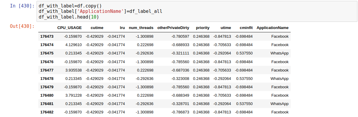
Separating Labels from Features
Quite frequently, labels (output values) come in the same dataframe as the features.
We need to separate label column(s) from the rest.
In our dataset, the ApplicationName column contains the labels
for classification machine learning.
Let’s extract that into df2_labels, whereas the features go to df2_features.
df2_labels = df2['ApplicationName']
df2_features = df2.drop('ApplicationName', axis=1)
print("Labels:")
print(df2_labels.head(10))
print()
print("Features:")
print(df2_features.head(10))
Labels:
176473    Facebook
176474    Facebook
176475    WhatsApp
176476    Facebook
176477    Facebook
176478    WhatsApp
176479    Facebook
176480    Facebook
176481    WhatsApp
176482    Facebook
Name: ApplicationName, dtype: object

Features:
        CPU_USAGE  cutime  lru  num_threads  otherPrivateDirty  priority  \
176473       0.00     0.0    0           11                292        20
176474       8.62     0.0    0           79               2804        20
176475       0.75     0.0    0           56              12884        20
176476       0.00     0.0    0           11                156        20
176477       8.23     0.0    0           79               2856        20
176478       0.75     0.0    0           56              12832        20
176479       0.00     0.0    0           11                156        20
176480       7.94     0.0    0           79               2820        20
176481       0.75     0.0    0           56              12676        20
176482       0.00     0.0    0           11                120        20

         utime       vsize  cminflt  guest_time  queue
176473    38.0  2095517696      0.0   -0.296330  100.0
176474   619.0  2203082752      0.0   27.548222  100.0
176475  2309.0  2042060800    502.0  109.719211  100.0
176476    38.0  2095517696      0.0   -0.350120  100.0
176477   619.0  2203082752      0.0   27.124219  100.0
176478  2309.0  2042060800    502.0  111.614032  100.0
176479    38.0  2095517696      0.0   -2.529499  100.0
176480   619.0  2203082752      0.0   25.905483  100.0
176481  2309.0  2042060800    502.0  112.931952  100.0
176482    38.0  2095517696      0.0   -2.204925  100.0
Note: We do NOT drop the ApplicationName column in-place,
so we have the backup of the cleaned data;
therefore we need to assign the feature-only dataframe
to a new variable called df2_features.
Check Your Data Preparation
At this point, check if you have obtained the same dataframe as shown in the last output. Otherwise you need to review what you have done and find out the cause of the discrepancy.
Here is the descriptive statistics of the cleaned data:
           CPU_USAGE         cutime            lru    num_threads  \
count  612114.000000  612114.000000  612114.000000  612114.000000
mean        0.321270       0.440516       0.022576      69.060714
std         2.009569       1.026775       0.540431      44.631287
min         0.000000       0.000000       0.000000       2.000000
25%         0.080000       0.000000       0.000000      47.000000
50%         0.150000       0.000000       0.000000      62.000000
75%         0.280000       0.000000       0.000000      93.000000
max       114.830000       6.000000      15.000000     184.000000

       otherPrivateDirty       priority          utime         vsize  \
count      612114.000000  612114.000000  612114.000000  6.121140e+05
mean        21683.881055      19.769636    3502.481438  2.170535e+09
std         27404.537243       0.935041    4086.378714  1.342683e+08
min             0.000000       9.000000       2.000000  0.000000e+00
25%          2220.000000      20.000000     400.000000  2.093793e+09
50%         12408.000000      20.000000    1786.000000  2.104795e+09
75%         30012.000000      20.000000    6047.000000  2.241188e+09
max        324024.000000      20.000000   29842.000000  2.718401e+09

             cminflt     guest_time          queue
count  612114.000000  612114.000000  612114.000000
mean      283.680636     171.622114     100.721940
std       406.137819     204.325334       2.954855
min         0.000000      -5.146332     100.000000
25%         0.000000      16.353102     100.000000
50%         0.000000      85.831846     100.000000
75%       513.000000     298.949347     100.000000
max      1550.000000    1490.823928     161.111111
Feature Scaling (Data Normalization)
Many ML algorithms work best when the typical values of the features are roughly comparable, i.e. of the same order of magnitude. Because in general each feature has its own range of values, feature scaling is necessary to bring all the features into similar orders of magnitude. (Strictly speaking, a range of a feature is technically the difference between the minimum and maximum values in that feature; but in practice it is often better to use the inter-quartile range and exclude the outliers because of the erratic behavior they may exhibit.)
Consider the ranges in the df2_features after the cleaning steps above:
-
The
CPU_USAGEvalues are quite small: near zero on average, with minimum and maximum values of 0 and 114, respectively. -
The
utimefield is also quite fluctuating: the values range from 2 to nearly 30,000, with average of about 3,500. -
The value of
vsizeis on average near 2.2 billion but there were some outliers that havevsize=0.
This is a very common situation with raw (unnormalized) data in machine learning. The large discrepancy in the range of values can cause problems for the algorithm used to optimize the model parameters. Sometimes this causes the parameters to converge very slowly, at other times the algorithm fail to converge the parameters.
Think about the Case without Normalization
The
vsizevalues are much larger in magnitude thanutime, but the latter varies more greatly. Which feature should make a bigger influence on the outcome of the machine learning?
Feature scaling, or data normalization, refers to a class of methods
to normalize the features to a similar range of values.
The most common methods center the mean of each feature to
a uniform value (usually zero)
and standardize the spread of the feature.
The sklearn.preprocessing module offers several scaling methods,
each tailored to tackle the challenges posed by different distributions
of values in the data.
A good starting point for most data would be
StandardScaler:
scaler = preprocessing.StandardScaler()
scaler.fit(df2_features)
df2_features_n = pd.DataFrame(scaler.transform(df2_features),
                              columns=df2_features.columns,
                              index=df2_features.index)
print(df2_features_n)
        CPU_USAGE    cutime       lru  num_threads  otherPrivateDirty  \
176473  -0.159870 -0.429029 -0.041774    -1.300898          -0.780597
176474   4.129610 -0.429029 -0.041774     0.222698          -0.688933
176475   0.213345 -0.429029 -0.041774    -0.292636          -0.321111
176476  -0.159870 -0.429029 -0.041774    -1.300898          -0.785560
176477   3.935538 -0.429029 -0.041774     0.222698          -0.687036
176478   0.213345 -0.429029 -0.041774    -0.292636          -0.323008
176479  -0.159870 -0.429029 -0.041774    -1.300898          -0.785560
176480   3.791228 -0.429029 -0.041774     0.222698          -0.688349
176481   0.213345 -0.429029 -0.041774    -0.292636          -0.328701
176482  -0.159870 -0.429029 -0.041774    -1.300898          -0.786873

        priority     utime     vsize   cminflt  guest_time     queue
176473  0.246368 -0.847813 -0.558714 -0.698484   -0.841396 -0.244324
176474  0.246368 -0.705633  0.242407 -0.698484   -0.705121 -0.244324
176475  0.246368 -0.292064 -0.956849  0.537550   -0.302963 -0.244324
176476  0.246368 -0.847813 -0.558714 -0.698484   -0.841660 -0.244324
176477  0.246368 -0.705633  0.242407 -0.698484   -0.707196 -0.244324
176478  0.246368 -0.292064 -0.956849  0.537550   -0.293689 -0.244324
176479  0.246368 -0.847813 -0.558714 -0.698484   -0.852326 -0.244324
176480  0.246368 -0.705633  0.242407 -0.698484   -0.713160 -0.244324
176481  0.246368 -0.292064 -0.956849  0.537550   -0.287239 -0.244324
176482  0.246368 -0.847813 -0.558714 -0.698484   -0.850737 -0.244324
Think about the Case with Normalization
The scaled features look very different from the original features. How can we be sure that machine learning model would still recognize that these different features describe the same data? Will scaling distort the outcome of machine learning? If not, why?
Feature Selection
In a machine learning project, generally speaking, we want to start with a handful of features (2-4) with the most predictive power. These are features that have the strongest influence on the model’s output. How do we select such features?
First we want to find features that are very similar, then drop the (near) duplicate features. We will use two complementary means to detect such duplicates: (1) histograms; (2) correlation plot.
Histogram is a visualization of the distribution of values in a feature. Let’s make a panel of histogram for all the normalized features:
# plt stands for matplotlib.pyplot
plt.figure(figsize=(10.0, 8.0))
for (i, col) in enumerate(df2_features_n.columns):
    # Creates a 4 row by 3 cols plot matrix
    plt.subplot(4,3,i+1)
    plt.hist(df2_features_n[col], bins=50)
    plt.title(col)

plt.subplots_adjust(top=0.92, bottom=0.08, left=0.10, right=0.95, hspace=0.75,
                    wspace=0.35)
plt.show()
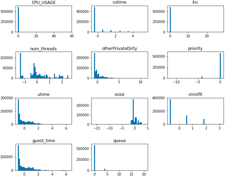
Visualizing histograms of multiple features in a panel form is a powerful tool to detect features that are identical or very similar.
Discovering Visually Similar Features
From the histogram panel above, determine features that are suspected to be identical or similar.
Solution
The following pairs show very similar distributions, so they are suspected to be duplicate of each other:
CPU_USAGEandlruutimeandguest_timeWe will confirm our suspicion using the second method (correlation plot).
Plotting Per-Category Histograms
Repeat the histogram panel above, but color the histogram differently for each category (
ApplicationName).Example Solution
Apps = df2_labels.unique()
plt.figure(figsize=(10.0, 8.0))
indx_app = {}
features_app = {}
for app in Apps:
    print("\nApp = ", app)
    indx_app[app] = df2_labels[df2_labels == app].index
    print("Index:")
    print(indx_app[app][:5])
    features_app[app] = df2_features_n.loc[indx_app[app]]
    print("Features:")
    print(features_app[app].head(5))

for (i, col) in enumerate(df2_features_n.columns):
    # Creates a 4 row by 3 cols plot matrix
    plt.subplot(4,3,i+1)
    for app in Apps:
        sns.distplot(features_app[app][col], bins=50, kde=False)
    plt.title(col)

plt.subplots_adjust(top=0.92, bottom=0.08, left=0.10, right=0.95, hspace=0.75,
                    wspace=0.35)
plt.show()
Run this code snippet and you will find an interesting insight.
Correlation
At this time, we may want to do further feature selection
from the correlation between each feature pairs.
Feature pairs that are highly correlated can be deemed as
duplicate features,
thus we can delete one of each pair.
The pair correlations can be computed using the .corr() method.
df2_corr = df2_features_n.corr()
df2_corr
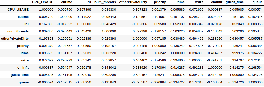
The .corr() method returns a matrix of correlation between feature pairs.
The maximum value is 1 (perfectly correlated, i.e. identical),
whereas the minimum value is -1 (perfectly anti-correlated).
For a pair with negative correlation,
it means that the increase in one feature leads to the decrease in the other.
Visualize the Correlation
Use the heatmap to visualize the correlation matrix above and find the highly-correlated feature pair(s).
Hint: Use the
sns.heatmap()function. Find pairs with correlation magnitude greater than or equal to 0.85.Solution
plt.figure(figsize=(10.0,6.0))
sns.heatmap(df2_corr, annot=True)
The three highly-correlated feature pairs are:
vsizeandnum_threads,queueandpriority(anti-correlated),utimeandguest_time.
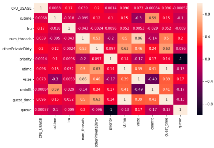
Cross-checking Histogram and Correlation
Although the histogram panel gives us the visual cues regarding similar features, the correlation matrix provides a definitive guide regarding which features are correlated—thus can be dropped.
Compare the finding of the two methods: histogram panel vs correlation heatmap.
Solution
The correlation heatmap confirms that
utimeandguest_timeare nearly perfectly correlated. However,CPU_USAGEis not correlated tolru. (Why is this?)The correlation heatmap discovers additional hidden relationships that are not obvious from the histogram.
Based on our discussion above, we delete vsize, queue and guest_time:
df2_features_n.drop(['vsize', 'queue', 'guest_time'], axis=1, inplace=True)
print(df2_features_n.columns)
Index(['CPU_USAGE', 'cutime', 'lru', 'num_threads', 'otherPrivateDirty',
       'priority', 'utime', 'cminflt'],
      dtype='object')
Simple Group Analysis
At this point, we have reduced our feature set to just eight
for the two applications (“WhatsApp” and “Facebook”).
The next thing to consider is the distribution of each feature
grouped by the application category.
This can be achieved by employing the .groupby() method.
Recall the
.groupby()Function
- As we now have removed the feature
ApplicationName, how to deal with it to successfully enable.groupby()?- As we can get the feature values for each app by
.groupby(), get the mean of each feature from same app.Hint: Add the
df_label_allto currentdf.Solution
- As for the first question:
- As for the second question:
Notice: Here we simply use the mean to represent the statistic for each feature of each app, discuss the other way we can explore.
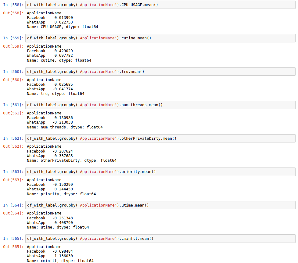
Then, the point is that if the statistic of feature values for each app are similar, This feature may not be able to distinguish the app, so we can resonably remove that feature.
Find the Close Statistic in Group Result and Remove
- Note the
CPU_USAGEandlruare much closer than others.- Remove the two fetures as follows.
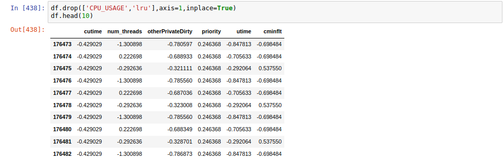
Data Visualization
We now have 6 remaining features,
a visualization for these features can help us have a better perception about their statistic.
The visualization can be achived by plt.hist()
Make a Series Plot to Visualize All Features
Hint: Use iteration to plot each feature with
plt.hist().Solution
j=1
for i in df.columns:
     plt.subplot(3,2,j)
     plt.hist(df[i],bins=100)
     plt.title(i)
     j=j+1
plt.subplots_adjust(top=0.92, bottom=0.08, left=0.10, right=0.95, hspace=0.75,
                   wspace=0.35)
plt.show()
The feature distribution is
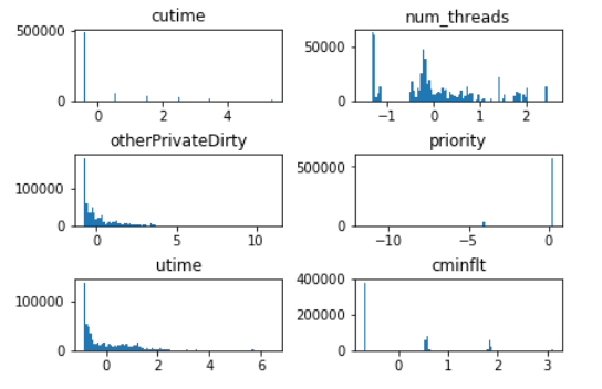
Compare the distribution of each feature, Can you find some features that are similar? Then,combine the correlation or heatmap we have obtained, and pick the two paris that are similar and show their correlation value. Fianlly, think about what to do with your found feature pairs that are similar.
Solution
The feature paris that are similar are
OtherPrivateDirtyandutime,cutimeandcminflt. We can also see from the heatmap above, that they have relatively high correlation values larger than 0.59. Then we can use.drop()to remove one feature in each similar pair bydf.drop(['utime','cminflt'],axis=1,inplace=True)
Encoding Categorical Features
Consider our present task to classify smartphone apps: we want to create a model to determine which app is currently running based on our selected features. The output of our ML model should tell us whether the predicted app is Facebook or WhatsApp. In other words, the output variable should be of a categorical data type. In many programming languages, plain integers are often used to represent categorical data, such as: 0 = red, 1 = green, 2 = yellow, 3 = blue, and so on. This is often termed integer encoding.
Because we only have two classes to distinguish here, we can use only one output with two possible numerical values: 0 and 1, corresponding to Facebook and WhatsApp, respectively. An analogy of this is like having one light bulb as the output of the model–the “light off” corresponding to value 0 (Facebook) and “light on” to value 1 (WhatsApp). This is a special case of integer encoding where one binary bit is sufficient to represent two categories.
Encoding Binary Classes
The goal of our classification task is to distinguish between two smartphone apps.
The original labels in the raw data contain string values Facebook and WhatsApp.
One way to convert the values to numbers is to use the replace() method:
df2_labels.replace(['Facebook', 'WhatsApp'], [0, 1], inplace=True)
This encoding step can be applied to both input and output features.
Scikit-learn classification objects
(such as LogisticRegression and DecisionTreeClassifier
that we will use in the next episode)
can actually handle output labels automatically;
therefore this step is not absolutely needed.
However, this step is required for categorical features present in the input data.
Encoding Multiple Classes
(FIXME – CONSTRUCTION) is turned off Imaging we have two lights to indicate one of the predicted app, then the light associated with WhatsApp turns on if it is the predicted result. Similarly, the light associated with Facebook should turns on if it is the predicted result. Then, if we view turning-on light as 1 and turning-off light as 0, and we also count the WhatsApp as the first light and Facebook as the second light, The output is recognized as 10 if the light for WhatsApp is on. In this case, we can quantify the output from category to binary bits.
In and Beyond two Categories
- What is the output bits if the output is Facebook.
- Assume we have 10 classes, discuss the output bits when each class is the prediction. Hint: Consider there are 10 lights corresponding to the 10 classes.
- As the light has two status namely off and on, here we have two classes, so can we use one light to make the classification? How can we make it?
There is one issue with this type of encoding: numerical values are used to represent “nominal”, i.e. not all categorical data has an order whatsoever.
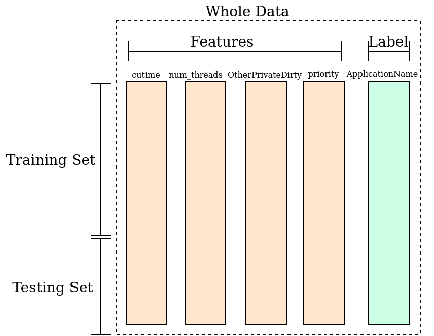
Splitting the Dataset: Training and Testing Sets
After we obtain the features, they will acts as the input for the machine learning.
Specifically, we want to train a mathematical model
that classify which app is running based on the measured features.
The training data (train_data and train_label)
we need some data to get the trained neual network and some data to act as the newly input features.
Here we call the data to train the neural network the training set,
and the data like the newly input features is referred as testing set.
The overall division of the above sets is shown as follows. With training set, we learn from the features and labels that what is the behavior of WhatsApp, and what is the behavior of Facebook. With testing set, we feed the newly features to the trained model and let the model do the prediction. The accuracy is obtained by comparing the correctly predicted instances with the number of whole testing samples.
The data split can be achieved by
from sklearn.model_selection import train_test_split
train_data, test_data, train_label, test_label \
    = train_test_split(df2_features_n, df2_labels, test_size=0.2, random_state=3227)
The random_state argument is optional.
We do this here so that the result is reproducible, as
train_test_split performs random selection of rows from the input dataset.
Explore the Final Datasets
Explore the contents of the train and test datasets to gain understanding of what they are:
How many rows and columns does each dataset have?
What happens to the row labels? Discuss the meaning of the above statements and think about the structures of training and testing sets.
Practitioner’s Notes
-
Some people would subdivide the master dataset into three categories: the training, validation, and test sets. Interested readers can learn more about the difference between validation and test sets in a blog by Jason Brownlee.
-
For amounts of data that are not too big, the 80/20 or 60/20/20 split is common. For extremely large number of records (in the many millions and beyond), we could reserve more for training to increase the method’s accuracy, something like 98/2 or 98/1/1. (Source: Andrew Ng)
Key Points
Data preparation steps can be grouped into two categories: data cleaning and feature selection.
Data cleaning steps include removal of irrelevant or duplicate data as well as handling of missing data.
Feature selection aims identify features with the most predictive power for machine learning?
Relevant features are selected through careful observation and performing correlation and simple grouping analysis.
The output for classification can be encoded into binary bits.