Data Wrangling and Visualization
Overview
Teaching: 10 min
Exercises: 20 minQuestions
How do I check data distribution and find inner relationships between different features?
How do I analyze features by using visualization tools?
Objectives
Understand different types of data
Clean and prepare raw data for further analysis
Gain familiarity with data distribution analysis and visualization tools
Perform exploratory data analysis to uncover patterns and relationships in the data
Imagine that you were just hired as a data scientist in a cybersecurity startup company “CSV CyberSecurity”. You were given the smartphone surveillance data collected using the “Sherlock” app (which we described earlier). Your supervisor asked you to look at the data, prepare and clean the data for further analysis using machine learning. In fact, the majority of a data scientist’s time (up to 2/3) is spent on preparing data so that they can be processed by machine learning algorithm. In this episode, we will give you a taste of data preparation. While many of the principles we learn here still hold, each problem and dataset has its own specific issues that may not generalize. There is an art to this process, which needs to be learned through much practice and experience.
Data preparation can be roughly divided into a number of steps:
-
Data wrangling (or data munging)
-
Exploratory data analysis (EDA)
-
Feature engineering
The goal of these steps is to produce clean, consistent, and processable data, which will become the input of further analysis such as machine learning. These steps are somewhat overlapping in function or order. We will cover aspects of data wrangling and exploratory data analysis in this lesson. The feature engineering step will be covered in the subsequent lesson on machine learning.
Reminder: Loading Python Libraries
If you jumped into this episode right away without doing the previous introduction to pandas, you will need to import a number of key Python libraries that we will need in this episode:
import numpy
import pandas
import matplotlib
from matplotlib import pyplot
import seaborn

## WARNING: Only add the following line if you are using Jupyter!
%matplotlib inline
The last line can only be used in the Jupyter Notebook environment, so that plots automatically appear as part of the Python cell outputs.
Pro Tip for Experienced Python Users
If you are an experienced Python user, you may like to add the following command (in addition to, or instead of, the original import commands) to shorten the module names:
import numpy as np
import pandas as pd
import matplotlib as mpl
from matplotlib import pyplot as plt
import seaborn as sns
This is a conventional practice among Python programmers and data scientists. If you choose this way, you will have to shorten all the module names throughout this lesson:
numpy→np,pandas→pd, and so on.
Loading Large(ish) Sherlock Data Subset
In this episode we begin working with data that is somewhat big. In your hands-on folder (the
sherlocksubdirectory) there is a large file namedsherlock_mystery_2apps.csv, about 76 MB in size.Let us load that to a
DataFramevariable nameddf2:df2 = pandas.read_csv("sherlock_mystery_2apps.csv")
Initial Data Exploration
Please perform some data exploration according to what we learned in the past two episodes. In particular, compare the statistics of the dataset between this one and the tiny one (variable
df_mysteryin the previous two episodes). Are there changes? How big is this dataset compared to thedf_mysterydataset?Solution
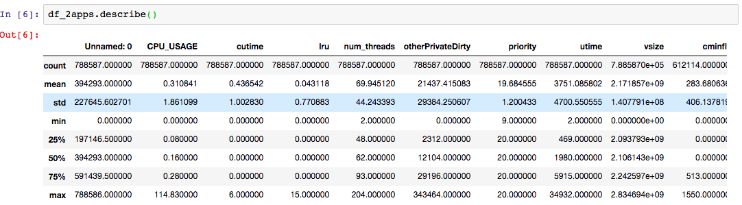
The statistical description of
df2looks like this:
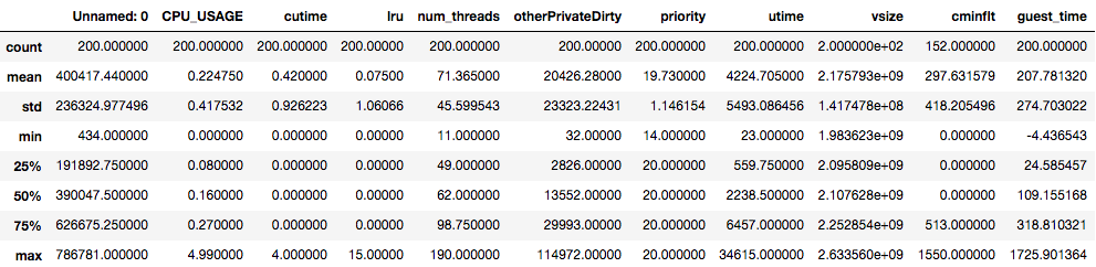
The statistical description of
df_mysterylooks like this:
Compare the statistical values for every column between the two datasets.
The
cutime,lru,num_threadscolumns have similar statistics.The maximum of the
CPU_USAGEdiffer significantly: the large dataset sees the maximum ofCPU_USAGEof nearly 115, whereas the maximum value on the small dataset is only 5. This may raise a question: Are there anything unusual about this? This may be ok, as we mentioned earlier that the highest value forCPU_USAGEshould be 100 for a fully occupied single core. Today’s smartphones have four or more cores, therefore 115 is not an unusual number.When comparing two datasets to decide whether they are statistically identical, ask the following questions for every feature in the datasets:
- Are the means overlaping with each other within the standard deviation?
- Are the standard deviations similar in magnitude?
- Are the quartiles (25%, median, and 75%) close to each other?
- Also consider the min and max values–although this can be more shaky because of potential outliers.
A careful inspection of the statistics above shows that
df2is statistically equivalent to the dataset used in the prior episodes, albeit being much larger dataset.(Note: There is a more rigorous way to establish the statistical similarity of two datasets, that is, by employing t-test.)
Why Data Preparation?
In real life, data does not always come in a clean and nice form. However, having a clean and reliable data is the cornerstone of trustworthy insight from the data. Remember the famous “garbage in, garbage out” adage: bad data lead to bad analysis and bad insight, resulting in bad decisions. Therefore, before the full data analysis can take place, we must first ensure that the data is clean, consistent, free of error, and is in processable format.
Some examples of common issues with raw data:
-
Missing data. For example, certain column may have missing values on several rows. pandas can accommodate missing data, but something has to be decided on those missing elements.
-
Bad or inconsistent data. For example, we may question a record on Sherlock’s
Applications.csvif thenum_threadsfield has the value of 100000. A normal app running on a phone may have up to ~100 threads, but it sounds out of the ordinary to have 100k threads in a single app! Such values are often termed outliers. Judgment call has to be made whether these outliers should be included in the analysis or be dropped. -
Duplicate data. Some rows of data may exist in duplicates (for example, by concatenating data sets from overlapping time periods). Or, some columns may contain redundant duplicate data. In some cases the duplicate can be very tricky (for example, one column contains temperature in units of Celcius and another in units of Fahrenheit). Or, as part of data preparation, one may generate additional features that are “cooked” from one or more features.
-
Irrelevant data. At times, certain features included in the dataset may not be relevant to answer our questions.
-
Formatting mismatch. For example, on several records, the event date is formatted like “January 25, 2020”, but on others, like “2020-01-25” and yet anoother, “01/25/2020”. Another example would be application name: “Google App” and “com.google.android.googlequicksearchbox” and “google” may refer to the same application, but they are clearly different strings.
-
Representation issue. This is a very common issue in real-world data, where some data may not come in forms immediately amenable to machine processing. These include: free-form textual data, images, videos, audio streams. Preprocessing these data with suitable tools can be made them useful for the overarching goal of the data analysis.
Data wrangling, sometimes also referred to as data munging, is the process of transforming and mapping data from one “raw” data form into another format with the intent of making it more appropriate and valuable for a variety of downstream purposes such as analytics (Wikipedia). Data wrangling aims at addressing issues with data such as pointed out earlier. This include steps such as:
- Understanding the nature of each feature (i.e., data type)
- Dealing with missing data
- Removing duplicate, bad, or irrelevant data
The process of data wrangling requires careful observation and a significant amount of exploration and experimentation. Data wrangling sometimes also calls for our sense of judgment. For example: What should we do with records that have missing or bad data? Should we drop the column? Or drop the row? Each action will have its on implications, so we have to consider these implications. Doing so requires some domain-specific knowledge (e.g. What is a “number of threads”? Can we take a sum over this quantity?)
While preparing data, we also want to gain knowledge (insight) about the data
via exploratory data analysis (EDA).
We want to learn how the values of each feature are distributed:
For example, how varying are the values of CPU_USAGE? How about vsize?
Are there outliers (rarely occuring values that lie far away from
the frequently occuring values)?
Do the values look consistent and sensible?
Later we also want to ask whether there are correlation among certain features.
Statistics and visualization are powerful tools to help us make sense of our data. Frequently, visualization helps us see data in different ways, leading to insight that we could not get simply by staring at plain numbers. Data exploration and wrangling, therefore, often rely on visualization.
Types of Data
Now that we are equipped with basic tools to work with our data, we need to learn more refined concepts about “data” in order to properly and meaningfully use, process, and understand them. Of key importance is the understanding of the taxonomy of data types beyond mere machine representation.
In a previous episode we mentioned that pandas handles
several types of data such as
(1) discrete numbers (int),
(2) continuous numbers (float),
or
(3) strings;
and that each column in a table has a specific data type.
This classification is made from the “machine” point of view.
From human point of view, toward which data carries certain meaning,
there are some nuances we need to be aware of.
In the discussion below, the term “variable” and “feature” both refer to
a column in a tabular data.
(The term variable comes from the world of statistics,
whereas the term feature is often used in machine learning.)
A tabular form of data has multiple records (rows);
each record contains one or more variables.
For example, in Applications.csv,
a row contains a record of (CPU, memory, network) statistics on
a specific application measured at an instance of time.
Numerical vs. Categorical
In general, a single feature (also called variable) can be classified into two general classes:
-
Numerical variable: variable in which a number is assigned as a quantitative value. Some examples: age, weight, interest rate, memory usage, number of threads.
-
Categorical variable: variable that is defined by the classes (categories) into which its value may fall. Some examples: eye color, gender, blood type, ethnicity, affiliated organization, computer program name.
Categorical variable comes in a finite number of classes. For numerical variable, the number of possible values can be finite or infinite.
Discrete vs. Continuous
There is another attribute describing data: whether it is continuous or discrete.
-
Continuous variable can in principle assume any value between the lowest and highest point on the scale on which it is being measured. Mathematically, this will correspond to a real number. Some examples: weight, speed, price, time, height.
-
Discrete variable can only take on certain discrete values. Discrete variable can be numerical (like the number of threads, product rating) or categorical (like color, gender). The set of possible values can be finite or infinite.
Qualitative vs. Quantitative
-
Qualitative variable: Its natural values or categories are not described as numbers, but rather by verbal groupings. The values may or may not have the notion of ranking, but their numerical difference cannot be defined. Categorical data is qualitative. An example of qualitative variable that can be ranked is product rating (e.g. poor, fair, good, excellent).
-
Quantitative variable are those in which the natural levels can be described using numerical quantities, and that the numerical differences among the values have a quantitative meaning (e.g. price, temperature, network bandwidth).
There is a finer taxonomy of data that we will not discuss in depth here. For example, some data are called ordinals—they appear to be numerics (such as product rating numbers from 0 to 5), but cannot be operated upon with the arithmetic addition and/or multiplication. They still carry the sense of order (rating 4 is higher than rating 3), but these numbers do not have the sense of magnitude. Interested readers are encouraged to read: “Types of Data & Measurement Scales: Nominal, Ordinal, Interval and Ratio”. This kind of data type classification has an important bearing for machine learning. Data that are not truly numerical will have to encoded in a way that will not be interpreted as “true numbers”.
For the purposes of machine learning and analysis, eventually non-numerical data like strings need to be converted to a form that is amenable to machine processing—in the most cases, they become categorical data.
Data Type Comprehension
Could you recognize what the data type of each feature in the
df2table? Hint: Use thedescribe()method anddtypesattribute.Solutions
There is only one categorical variable in the dataset, that is, the
ApplicationNamecolumn. In our current table, it has only two possible values:The rest are numerical values. From the datatype description, we can see immediately that there are 7 discrete variables:
Unnamed: 0,lru,num_threads,otherPrivateDirty,priority,vsize,Mem; and six continuous variables:CPU_USAGE,cutime,utime,cminflt,guest_time, andqueue.
It is imperative that we understand the nature of each feature in the dataset. It is rather easy to discriminate catagorical features from the numerical ones; distinguishing the rest of taxonomy (discrete vs continuous) would require more careful examination. We can use visualization to discover the properties of each feature.
Cleaning Data
Practice All the Exercises!
It is crucial that you do all the exercises in this section. Data is not perfect in any real data-science project, therefore you need to gain experience in identifying and correcting issues in data.
Dealing with Irrelevant Data
Dropping Useless Data
Examine all the features (columns) in the
df2dataframe; discuss with your peers the meaning of each feature (see the previous episode). Do you spot any feature that is not necessary or irrelevant for identifying application type later on?Hint: There is one feature that has nothing to do with the characteristics of a running application which can be removed. Remove the corresponding column to tidy up the data.
Solution
Examination of the
Unnamed: 0field (and description) shows that this has nothing to do with the type of application being measured. You can (and should) drop this feature.df2.drop(['Unnamed: 0'], axis=1, inplace=True)
Dealing with Missing Data
When dealing with missing data, we first need understand why the data goes missing. Was it something completely random and unexpected, or was there something “hidden” within the fact that the data is missing?
-
Missing Completely at Random (MCAR) — The fact that a certain value is missing has nothing to do with its hypothetical value and with the values of other variables.
-
Missing at Random (MAR) — Missing at random means that the propensity for a data point to be missing is not related to the missing data, but it is related to some of the observed data. This type of missing data could frequently be guessed from other measurement records. For example, suppose in a dataset of weather measurement (where we have fields of time, temperature, humidity, wind speed, etc) suddenly in one row we have missing temperature due to instrument glitch. We could use nearby data to fill in the missing value. We may fill in the missing data by means of interpolation.
-
Missing not at Random (MNAR) — Two possible reasons for this kind of missing data: (1) that the missing value depends on the hypothetical value (e.g., People with high salaries generally do not want to reveal their incomes in surveys); or (2) missing value is dependent on some other variable’s value (e.g. Females generally don’t want to reveal their ages. Here, the missing value in age variable is impacted by gender variable)
In the first two cases, it may be safe to remove the data with missing values, or perform imputation (substitution of missing values with reasonable values). But always do this with great care, because we have to be cognizant of the effect of our action. MCAR data is safe to discard; but generally it is very hard to be certain that that a certain value is indeed MCAR. We should avoid MCAR assumption as much as possible.
In the third case of missing data (MNAR), removing observations with missing values can produce a bias in the model (in the examples about missing age information, removing the data has a great likelihood of discarding observation from a good number of female participants). So we have to always be careful in removing observations. Note that imputation does not necessarily give better results.
Pandas’ Tools for Missing Data
In pandas, a missing value is denoted by nan
(a special not-a-number value defined in the numpy library).
A DataFrame or Series object has the following methods to deal with missing data:
notnull()andisna()methods detect the defined (non-null) or missing (null) values in the object, respectively, by returning a DataFrame or Series of boolean values;dropna()method removes the rows or columns with missing values;fillna()fills the missing cells with a default value.
Playing with Missing Data
This exploratory exercise will help you to become familiar with pandas’ facilities for handling of missing data. We encourage discussion with other participants to help you learn. Also consult pandas documentation on missing data.
First, create a toy DataFrame below that has lots of missing data.
import numpy
nan = numpy.nan
ex0 = pandas.DataFrame([[1, 2, 3, 0],
                        [3, 4, nan, 1],
                        [nan, nan, nan, nan],
                        [nan, 3, nan, 4]],
                       columns=['A','B','C','D'])
To learn how pandas identify missing values, try out the following commands and observe the outcome. What does each command mean and what is the meaning of its output?
ex0.notnull()
ex0.isna()
ex0.isna().sum()
ex0.isna().sum(axis=0)
ex0.isna().sum(axis=1)
Do the same observation for the following commands to handle missing data:
ex0.dropna()
ex0.dropna(how='all')
ex0.dropna(axis=1)
ex0.fillna(7)
ex0.fillna(ex0.mean(skipna=True))
Explanation
The
notnull()andisna()methods are ways to detect non-null or null (N/A, or missing) data, respectively. Theisna()method call followed bysum()can be used to count the number of missing values in each column (which is the default, withaxis=0) or in each row (usingaxis=1). In Python, for summing purposes, aTruevalue counts as numerical 1 and aFalseas 0.You can use
dropna()to remove records or columns containing missing values, or usefillna()to fill the missing values with a given value. The lastfillnastatement above fills the missing values using the per-column means computed from the non-missing elements.
Missing Data in Sherlock Dataset
Does Sherlock application dataset (df2) contain missing data?
If so, how shall we deal with them?
Have a brainstorming with your peer on the best way to address missing data,
if any.
Identifying Missing Data
Identify the features in
df2that have missing data.Solution
print(df2.isna().sum())Unnamed: 0 0 ApplicationName 0 CPU_USAGE 0 cutime 0 lru 0 num_threads 0 otherPrivateDirty 0 priority 0 utime 0 vsize 0 cminflt 176473 guest_time 0 Mem 0 queue 0Alternative: Some of the exploratory methods we learned earlier can also unveil missing data. Which one(s) is that, and how can you detect missing data using the method(s)?
Hint
Look at the output of
df.describe()anddf.info(). Compare the number of the non-null elements in each column to the overall shape of the DataFrame.Another alternative is to use
df.count(), which by default counts the non-null values in each column.
You identified one column with missing data. The count of missing data is quite significant—over 20% of the rows have this one variable missing.
Nature of Missing Data
Before doing something with the missing data, we need to understand the nature of the missing data in
df2. Of the three categories of missing data listed above, which one is most likely the cause?Solution
Plotting the values of
isna()method on this feature in an x-y plot (with the row number as the x values) shows something striking:cminflt_missing_plt = df2['cminflt'].isna().astype(int).plot()
All the missing values are located at the earlier part of the dataset. The most likely reason is that this missing data was caused by the addition of features collected at a latter stage of the experiment. In this case, it matches “Missing Not at Random”, for there is a plausible explanation of the missing data.

Now we come to the crucial question: What should we do with the missing data in the SherLock dataset? There are several possible ways to go about:
-
Drop all the rows that have missing any data.
-
Drop the one column with missing data (
cminflt) from the table. -
Imputation: Fill the missing value with something reasonable and plausible.
Each of these choices is a tough choice,
because it can have ramifications to the outcome of the data analysis.
For example, can we drop all the rows that have missing data?
If we do so, we will lose many samples.
But if we drop the column, we will lose that one feature (cminflt)
where many values are still defined.
What to Do with Missing Data
Discuss the pros and cons of the choices for tackling the missing data, and select an option that appears to be the best option.
Solution
Dropping the rows with missing data may be acceptable because we have a lot of samples (nearly 800k rows). If there are no out-of-the-ordinary events in the samples that are dropped, and there is no long-range trend in the samples as a function of time, then we simply have fewer samples and slightly higher statistical uncertainties.
A few other options to explore:
Dropping the
cminfltcolumn entirely: This may be acceptable if we can determine that this feature is not relevant for the (analytics or machine learning) questions we have at hand.Replacing the missing data with a reasonable value, such as zero or the mean of
cminflt. One way to determine what value is suitable is to draw histogram of the non-null values and see the spread, or determine the most frequently appearing values (i.e. the mode).Replacing the missing data with smarter guess values (advanced). We can imagine performing a small “machine learning” experiment to guess the
cminfltvalue based on the other features. That is tricky, however. If this is successful, then there is very likely a strong correlation betweencminfltand the other features, which means thatcminfltmay not be an important feature due to this strong correlation.
In real data-science projects, one will have to perform post-analysis to obtain additional confirmation that the chosen treatment of missing data does not cause undue bias in the analysis. Quite often, one may have to experiment with several scenarios above, and observe how a particular treatment affects the outcome of the data analysis.
This brief discussion shows that missing data is a complex issue for any data-intensive research. The following book contains a thorough discussion on how one should go about tackling the issue of missing data:
Flexible Imputation of Data, Second Edition, by Stef van Buuren, published by CRC/Chapman & Hall, July 2018. The online version is available to read for free at https://stefvanbuuren.name/fimd/. Hard copy books can be purchased from the publisher’s website.
Addressing SherLock’s Missing Data
Decision: For our learning purposes, in this module we will simply drop the rows that have missing
cminfltvalues, because we have nearly 800k rows in the original dataset. After removing these rows, we still have over 600k rows.df2.dropna(axis=0, inplace=True) print(df2.isna().sum())Warning
Cybersecurity events are often outliers and rare events. Therefore in real-world data-driven cybersecurity applications, it is generally better not to completely remove samples that have of missing data, because we could have missed potential events recorded in the removed samples.
Alternative: Filling with Zeros
A simple alternative to preserve more data is to fill the missing data with a reasonable guess. Use the
value_count()method to show that zero is the most frequently appearing value incminflt. Based on this, we will replace the missing values with 0.df2['cminflt'].fillna(0,inplace=True) print(df2.isna().sum())You are strongly encouraged to perform parallel analyses for the different scenarios of deletion or imputation, then compare the outcomes based on these different approaches.
Duplicate Data
There are many reasons that data can get duplicated. Consider, for example, two datasets:
-
set 1 was collected from 2016-01-01 through 2016-01-31
-
set 2 was collected from the fourth week of January through February of 2016: 2016-01-25 through 2016-02-26.
When we concatenate the two sets, there was overlap of the measurements done from 2016-01-25 through 2016-01-31. The chance that this kind of duplicate would creep in increases when the amount of data (or the number of the datasets) is very large, or when we have to combine data from variety of sources.
Another possibility is duplication in the features (columns). Suppose that there are two features that are correlated. For example, one column contains memory usage in units of bytes, whereas another column contains the same data in units of gigabytes. The correlation could be more subtle: suppose an instrument measures physical quantities from a radio equipment such as the frequencies, wave lengths, signal strength, duration, and many other characteristics. But there is a one-on-one relationship between the frequency and wave length (i.e. they are inversely proportional). At other times, the duplication is not obvious until we perform deeper analysis such as correlation plot (described later in this lesson). These duplicate columns can creep in easily and unintentionally in real-life data collection. Duplicate columns can lead to degradation of data quality, which can affect the downstream analysis such as machine learning.
In the data wrangling process, we can use pandas functionalities to discover such duplicate data and remove them. Some of these steps can be automated, but we (the data scientist) are ultimately responsible for identifying the duplicate data and taking the correct actions.
Do you find any duplicated data in the Sherlock dataset? It is not easy to find it by eye.
In the toy problem above, let us artifically introduce two duplicated rows.
Then let’s detect for this problem using the duplicated method:
df3=df2.iloc[0:2].copy()
df3.rename(index={0: 'a'},inplace=True)
df3.rename(index={1: 'b'},inplace=True)
df2=df3.append(df2)
df2.duplicated()
print(np.asarray(df2.duplicated()).nonzero())
df2.drop([2,3], axis=0,inplace=True)
df2.reset_index(drop=True)
Explanation
df.duplicated()will check the Data line by line and will indicate the dulicated line by label True- reset_index(),can be used to rearrange your index
Visualization
Visualization is a powerful method to present data in many different ways, each uncovering patterns and trends existing in the data. When handling and analyzing massive amounts of data, visualization becomes indispensable. In this section, we will showcase many visualization capabilities provided by Matplotlib, pandas, and Seaborn.
-
Matplotlib is an open-source Python 2D plotting library which can produce publication-quality figures in a variety of hardcopy formats and interactive environments across platforms. Matplotlib can be used in Python scripts, plain Python and IPython shells, Jupyter Notebook, web application servers, and graphical user interface toolkits. The project website is https://matplotlib.org.
-
Seaborn is another open-source Python data visualization library based on matplotlib, specializing in drawing “attractive and informative statistical graphics”. Visit https://seaborn.pydata.org for more information.
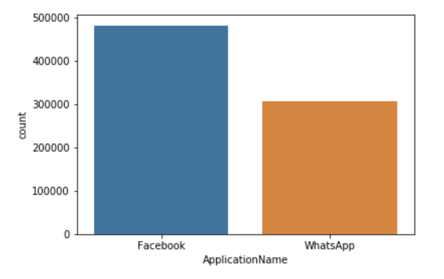
Count Plot
A count plot shows the number of occurrences of various values in a categorical variable.
seaborn.countplot(x='ApplicationName', data=df2)
Cross Checking
Without plotting the data, use the grouping and aggregating operations (
groupbyandsize) to cross-check the count plot above.Solutions
df2.groupby('ApplicationName').size()ApplicationName Facebook 481760 WhatsApp 306827 dtype: int64
Histogram
A histogram displays the distribution of values (shape and spread) in the form of vertical bars. The range of the values (i.e., from the minimum value to the maximum value) are split into multiple bins on the horizontal axis. The count (frequency) of values occuring within each bin’s range is displayed as a vertical bar for each bin. Taller bars show that more data points fall in those bin ranges. (There are some variations in how histograms are presented. For example, histograms can be rotated—where the bins appear on the vertical axis and the bar heights vary along the horizontal axis.)
Try out the following commands and discuss the output that you see:
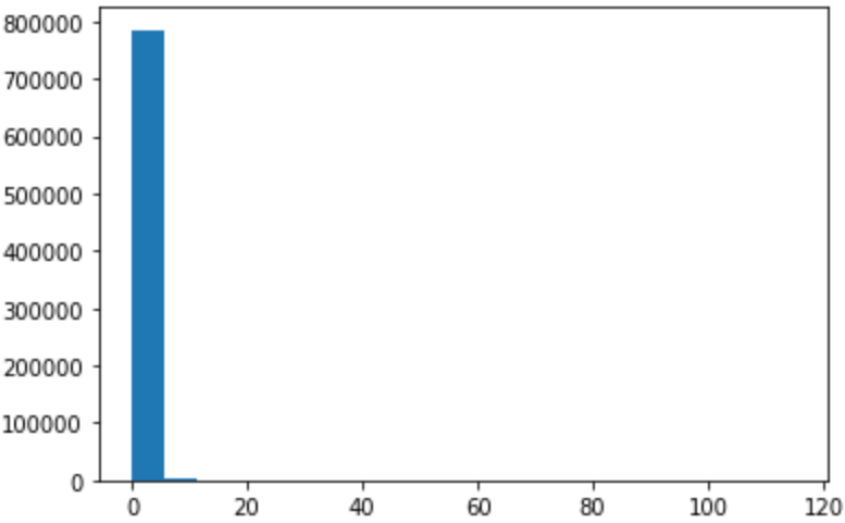
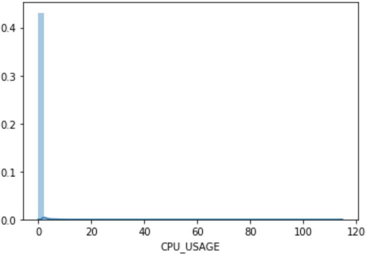
pyplot.hist(df2['CPU_USAGE'],bins=20)
seaborn.distplot(df2['CPU_USAGE'])
pyplot.hist(df2['priority'],bins=20)
pyplot.hist(df2['num_threads'],bins=20)
Let us focus on the CPU_USAGE histogram here.
On Jupyter, the picture of the histogram from these commands will also
appear on the output.
|
|
Output of pyplot.hist(df2['CPU_USAGE'],bins=20)
|
Output of seaborn.distplot(df2['CPU_USAGE'])
|
Figure: Histograms of CPU_USAGE.
The left graph was produced by pyplot.hist,
whereas the right one was by seaborn.distplot.
The pyplot.hist(df2['CPU_USAGE']...) yields the following output:
(array([7.8551e+05, 1.4420e+03, 5.3100e+02, 2.7400e+02, 1.8400e+02,
        1.2500e+02, 1.0900e+02, 7.3000e+01, 5.0000e+01, 4.6000e+01,
        5.8000e+01, 3.6000e+01, 2.4000e+01, 4.6000e+01, 2.3000e+01,
        3.0000e+00, 9.0000e+00, 4.0000e+00, 6.0000e+00, 3.4000e+01]),
 array([  0.    ,   5.7415,  11.483 ,  17.2245,  22.966 ,  28.7075,
         34.449 ,  40.1905,  45.932 ,  51.6735,  57.415 ,  63.1565,
         68.898 ,  74.6395,  80.381 ,  86.1225,  91.864 ,  97.6055,
        103.347 , 109.0885, 114.83  ]),
 <a list of 20 Patch objects>)
This is a tuple consisting of three components:
- an array of the counts on the individual bins;
- an array of the bin edges (it has one extra element compared to the counts because there are n+1 edges for n bins);
- a list of twenty matplotlib’s
Patchobjects—which are the software representation of the 20 bars in the histogram.
The arrays are helpful for close-up analysis.
At first, we may be misled by the graph thinking that
only the leftmost bin (with values ranging between 0 and 5.7415)
has non-zero frequency of CPU_USAGE.
But close inspection of the “count” array above
shows that the bar values are nonzero everywhere,
except that the magnitudes are much smaller compared to that of the first bin.
Discussion Questions
Can we use histogram on categorical data?
Why
seaborn.distplotproduces histogram bars with radically different heights from thepyplot.hist? Can we make them the same?Do the bins have to be of the same width?
Explanation
Histogram implies data that is numerically ordered, therefore it cannot be used to display the distribution of categorical data. Count plot is the appropriate tool for categorical data, analogous to histogram for categorical data.
The y (vertical) axis generally represents the frequency count. However, this count can be normalized by dividing with the total count to create a normalized histogram (i.e. a density function).
seaborn.distplotproduces density function by default, whereaspyplot.hista raw-value histogram.To make
pyplot.histdisplay likeseaborn.distplot:plt.hist(df2['CPU_USAGE'], bins=50, normed=True)To make
seaborn.distplotdisplay raw values,seaborn.distplot(df2['CPU_USAGE'], norm_hist=False, kde=False)Without the
binspecification,seabornwould guesstimate a good number of bins to use for the given data.Histogram bins commonly have the same widths. It is possible to do so by manually specifying the bin edges in the
binsargument; but then the interpretation of the bar height would vary depending whether we want the “raw count” or the “normalized density” of the values. In this scenario, it is more logical to display the normalized density such that the product of the height and the width of a bar corresponds to the count of the values in that particular bin. Such histograms could be helpful to highlight more occurence variations in the range where there are more data points.
Here are the plots of the other two histograms:
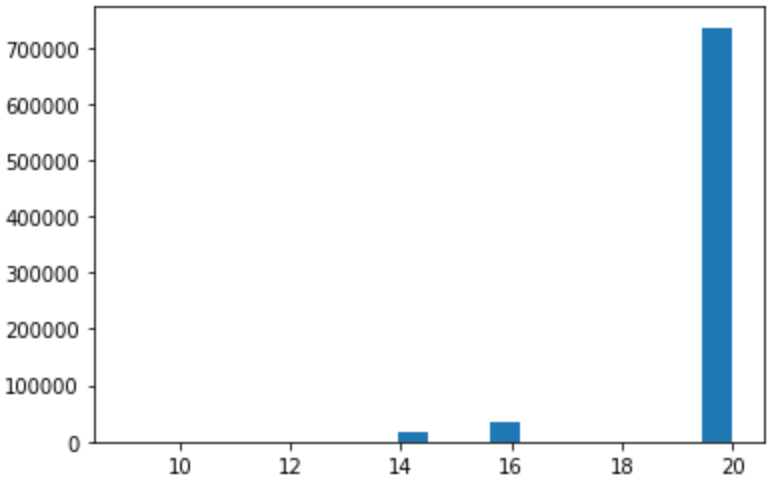 Figure: Histogram of
 priority
The priority feature contains integer values, and this histogram
shows that only a handful values appear.
Frequently, data that appears in this way when plotted as a histogram
is a tell-tale sign of categorical or ordinal data.
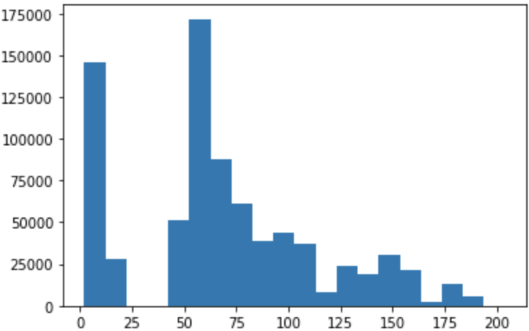 Figure: Histogram of
 num_threads
The number of threads shows a multimodal distribution (two major peaks and two smaller peaks). It is actually interesting to plot the histogram separately for the two applications:
nthrds_FB = df2[df2['ApplicationName'] == 'Facebook']['num_threads']
nthrds_WA = df2[df2['ApplicationName'] == 'WhatsApp']['num_threads']

seaborn.distplot(nthrds_FB, kde=False, label="Facebook")
seaborn.distplot(nthrds_WA, kde=False, label="WhatsApp")

pyplot.legend()
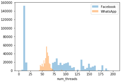 Figure: Histograms of
 num_threads grouped by application type
Characterizing Behavior of Different Applications
The last plot shows histograms of
num_threadsdrawn for individual applications. A glance of this plot visual cues about the differences between the two applications being considered. Discuss the differences you can uncover using the histogram plot.Discussion
From this graph it is clear that (1) most of the time, WhatsApp keeps the number of threads between 50–75; (2) Facebook’s number of threads vary quite wildly from ~1 to almost 200, with high number of threads (>75) being quite common.
The overall shape of the graph looks somewhat different from the because of the different binning schemes.
Data Distribution
Data visualization is the act of taking information (data) and placing it into a visual context, such as a map or graph.
Data visualizations make big and small data easier for the human brain to understand, and visualization also makes it easier to detect patterns, trends, and outliers in groups of data.
Good data visualizations should place meaning into complicated datasets so that their message is clear and concise.
Bar Plot
A bar plot displays an estimate of central tendency for each numerical variable with the height of each rectangle being its mean value, the errorbar providing some indication of the uncertainty around that mean value.
sns.barplot(x='ApplicationName', y='CPU_USAGE', data=df2)
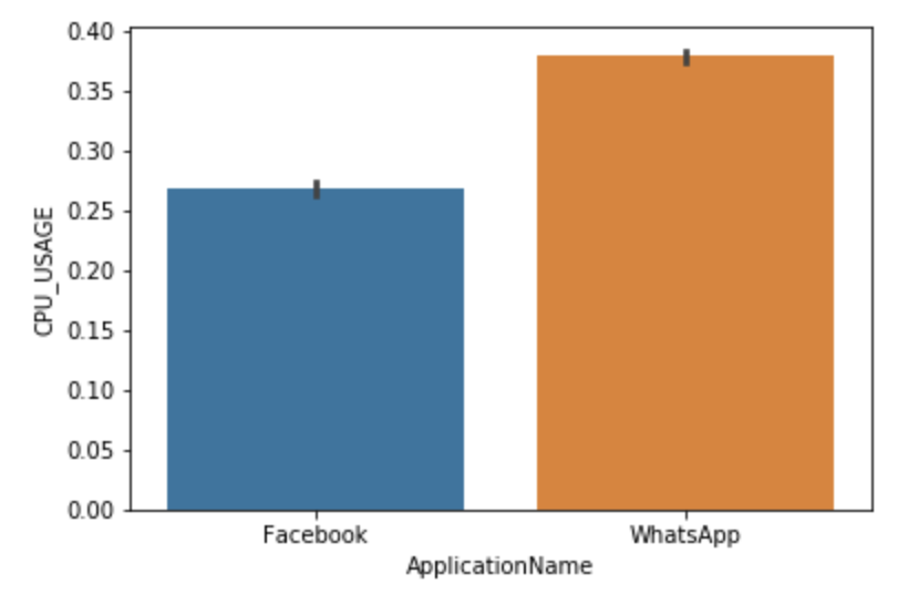
What Do These Bar Plots Tell Us?
- Which type of data can use a barplot to present?
- What are black lines in barplot?
- Can you try other parametrs and infer some interesting result?
Explanation
- The data are numerical
- In a barplot, the black lines shows the distribution of the values.
TODO:: What is the diference between barplot and countplot???
boxplot
FIXME Remove this altogether–leave this on episode 10-pandas-intro.
A boxplot is a standardized way of displaying the distribution of data based on a five number summary (“minimum”, first quartile (Q1), median, third quartile (Q3), and “maximum”). It can tell you about your outliers and what their values are.
- interquartile range (IQR): 25th to the 75th percentile.
- “maximum”: Q3 + 1.5*IQR
- “minimum”: Q1 -1.5*IQR Can you try the commands below and explain each output means?
sns.boxplot(df2[0:2000].guest_time)Thinking:
Where is the maximum, minimum,median?
- Which type of data can use a boxplot to present?
Explanation
- In common, we think those data which out of range maximum is outlier. However, it is based on an assumption which the data is a normal distribution. Apparantly, it is not our case, we can’t not simply delete our ‘outliers’.
Correlations Among Features
In the preceding sections we are focused on individual features found in a dataset. However, data contains many features, and there may be correlations among these features such that they are not totally independent among each other. Inter-feature correlations are important facts we need to discover in the dataset because it will have important implications on advanced data analysis using machine learning.
Correlation, or dependence, is “any statistical relationship, whether causal or not, between two random variables or bivariate data” (Wikipedia). (A reminder: For our discussion here, variable is equivalent to feature elsewhere in this lesson.) Two variables are said to be correlated when the change in value in one variable is accompanied by a systematic change (in a statistical sense) in the other variable. Here are some examples:
- Persons with higher incomes tend to own more expensive houses;
- The price of a commodity (think: gasoline, grocery, etc.) will increase when there is more demand than demand; at the same time, the commodity price tend to go down when the supply increases given a fixed demand (in this respect, there is an inverse correlation between the price and supply);
- In cybersecurity, there is a strong correlation between the continual use of outdated software (operating systems, web servers, database servers, etc.) and the increased likelihood of the compromise caused by a cyber attack.
Correlation is a statistical property of data, meaning it is measured as a collective property of the variable pair. One particular value pair might differ from the expected trend, but on average, the value pairs exhibit this trend.
There are a number of correlation functions which can be used to quantify the strength, or the degree, to which a variable pair are affecting one another in this way. A commonly used function is the Pearson correlation coefficient, which measure the linear correlation between two variables. Pearson’s correlation coefficient is usually denoted by the symbol r. We will plot the values of Pearson correlation coefficients as a heatmap below.
Scatter Plot and Joint Plot
Visualization is a great tool to help identify correlations in data. Of particular note is a type of visualization called scatter plot. The scatter plot displays the data points of a variable pair in a two-dimensional graph, where the x values of the points come from one variable, and the y values come from the other. The result of the graph visually shows how (and how much) one variable is affected by the other. Correlation appears as a visible pattern on scatter plots. At the same time, the plot also shows the possible ranges of the two variables and the possible values of the pairs.
The following picture is a panel of several scatter plots created using hypothetical variable pairs (taken from Wikipedia):

The numbers printed above each scatter plot is the Pearson’s correlation coefficient r for that particular variable pair. Note that when two variables are linearly dependent (such is the case on the top left corner panel), then the r value is 1 (the maximum possible value). If the linear dependency has a negative slope, then the r value is -1 (the most negative possible value or r). When the r value is zero, however, it does not necessarily mean that there is no correlation between the pair. For example, from visual inspection, we can conclude that the pair shown on the bottom left plot has a nonlinear correlation–the overall shape of the pair plot looks like a lowercase “w” letter. The Pearson correlation coefficient of this pair, however, is zero.
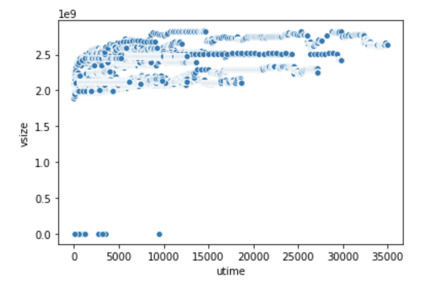
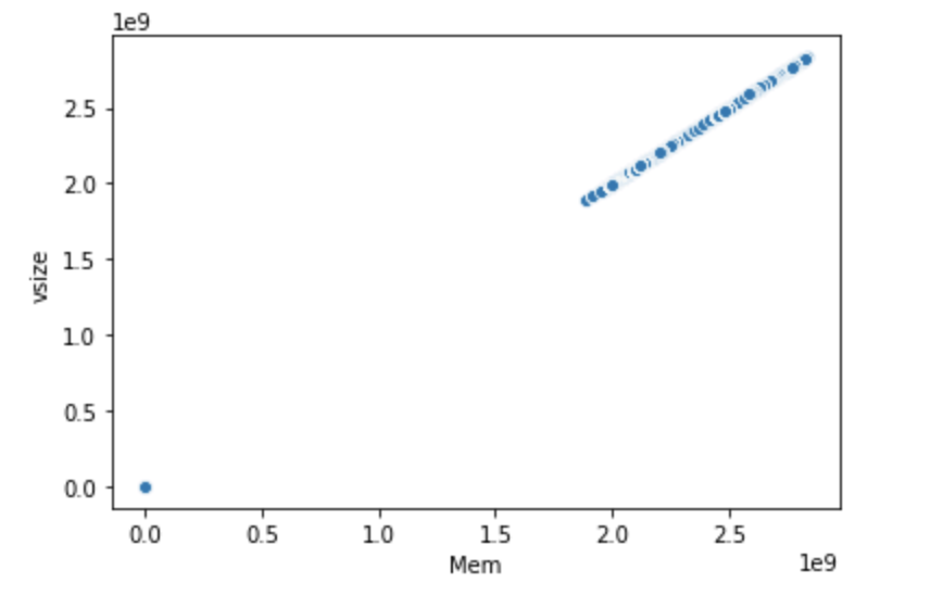
Let us now consider two value pairs in the SherLock’s application dataset, drawn using Seaborn:
seaborn.scatterplot(x="utime", y="vsize", data=df2)
seaborn.scatterplot(x="Mem", y="vsize", data=df2)
|
|
Scatter plot of (utime, vsize) variable pair.
|
Scatter plot of (Mem, vsize) variable pair.
|
Identifying Correlations
What does it mean for two variables to have a linear correlation? When we change the value of one variable by n (a multiplicative constant), what will become of the other variable?
If two variables have a perfect linear correlation (r = 1), what will show on their scatter plot?
From the two scatter plots above–which pair has linear correlation?
Explanation
A linear relationship is one where increasing or decreasing one variable by a factor of n will lead to a corresponding increase or decrease by n times in the other variable too. As an example, if we double one variable, the other will double as well.
The scatter plot will look like a straight line (with a nonzero slope).
The scatter plot shows that
vsizegrows propertionally asMem; they have extremely strong linear correlation as shown by the straight line appearance of the scatter plot. In contrast, the (utime,vsize) pair doesn’t exhibit this kind of relationship. This is an example of a pair plot where the two variables are hardly correlated.
A joint plot draws a 2-D joint distribution of two variables (such as a scatter plot) accompanied by the individual distribution of each variable as a histogram on its respective axis.
seaborn.jointplot(x="Mem", y="vsize", data=df2)
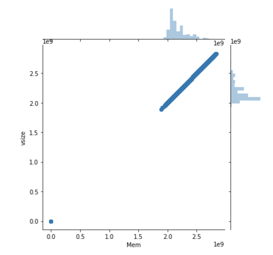
This plot makes it easy to compare the distribution of each variable as well as uncover potential correlation between them.
Pair Plot
While a scatter plot or joint plot exhibits correlations for a pair of variables,
it is often desirable to gain the “big picture” of a dataset by observing
the correlations (or bivariate distributions) from many pairs simultaneously.
Seaborn’s pairplot() function does this task with ease.
This creates a matrix of plots and shows the relationship for each pair
of columns in a DataFrame.
By default, it also draws the univariate distribution (i.e. histogram)
of each variable on the diagonal part of the matrix:
df2_demo=df2.iloc[:,5:9]
sns.pairplot(df2_demo)
Heat Map
It is often desirable to show data which depends on two independent variables as a color-coded image plot, where the color indicate the magnitude of the value. This is often referred to as a heatmap. Heatmap is very useful because we frequently obtain new insights by presenting the data in this format. As an example, let us we compute and plot the pairwise correlation among pairs of variables in the dataset.
df_corr = df2.corr()
plt.subplots(figsize=(12, 12))
sns.heatmap(df_corr, annot=True, vmax=1, square=True, cmap="Blues")
plt.show()
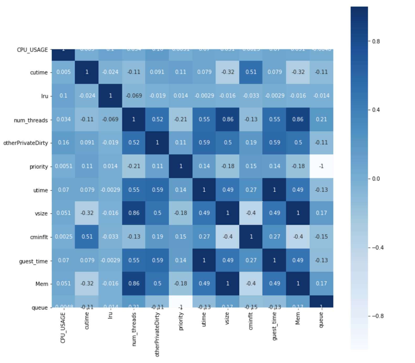
We use the following functions/methods:
DataFrame.corr()– Computes pairwise correlations across all the pairs of DataFrame features, excluding NA/null values. By default the Pearson correlation function is used.seaborn.heatmap(matrix, [options...])– Plots a heatmap of the the computed correlated dataframe
This exercise entails the following steps:
- Compute the pairwise correlations of
df2, saving them in a new dataframe calleddf_corr. - Plot a heat map of the correlation dataframe.
The Pearson correlation function yields 1.0 if the correlation is perfect with a positive constant factor. It returns -1.0 if the correlation is perfect with a negative constant factor.
Two variables are said to have a linear relationship if the change in one variable will lead to the change in the other within a proportional constant. Mathematically:
var2 = constant * var1
For example, if you double the values of one variable, the other will double in values as well. These two variables will have the maximum Pearson correlation value (1.0). One of these variables will be redundant—only one needs to be included in the dataset.
Other types of correlation exist; they do not have to be linear. For this reason, we see pair of features with correlation values between -1 and 1.
Considering this fact, let’s examine the correlation heat map above:
-
It looks like
vsizehave perfect correlation withMem. In fact, if you examine the data,Memis identical tovsize. -
On the other hand,
utimeandvsizedon’t have this kind of relationship.
Challenge
Please identify the pair of features that have very high correlations.
Solution
Memandvsizehave a correlation value of 1, as we have previously mentioned.guest_timeandutimehave a correlation value of 1.priorityandqueuehave a correlation value of -1.vsizeandnum_threadshave a correlation value of 0.86.Memandnum_threadsalso have a correlation value of 0.86; but this is a corollary ofMemandvsizebeing identical.
Challenge
Please make a decision of which columns to drop, based on all the correlation analyses done above.
Solution
We can drop the following columns:
Memguest_timequeue(You may arrive at a different combination since you may have dropped the other feature in a given pair.)
Epilogue
There are many more types of visualization that we can produce using Seaborn. Please visit Seaborn’s Example Gallery to learn more.
Key Points
Visualization is a powerful tool to produce insight into data.
Histogram is useful to display the distribution of values.